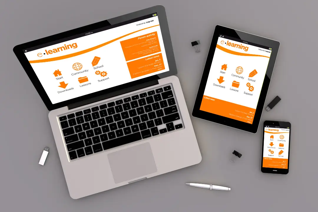
Most visitors now browse on their phones, and Google ranks websites based on their mobile version. Responsive web design means your site adapts to every screen size, so visitors can read, navigate and contact you easily wherever they are.
What a responsive website gets right
- Layouts that rearrange cleanly from phone to widescreen.
- Readable text and buttons big enough to tap.
- Images that resize and load quickly on mobile data.
- Menus that are simple to use with one thumb.
Google explains why this matters in its guide to mobile-first indexing. Related: speed optimisation and website redesign.